As Pride Month begins, it's important to reflect on the symbol that has become synonymous with the LGBTQ+ community – the Pride flag.
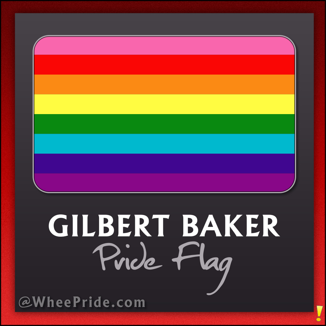
Designed by Gilbert Baker in 1978, the original flag holds deep meaning and serves as a powerful symbol of inclusion and diversity.
The Pride flag first appeared at the San Francisco Gay Freedom Day Parade on June 25, 1978. Created at the request of Harvey Milk, one of the first openly gay elected officials in the United States, the flag was intended to represent the diverse LGBTQ+ community and its vibrant culture. Each color carries significance:
Since 2021, the last remaining fragment of the original Pride flag is now on display at the GLBT Historical Society Museum in San Francisco, a powerful reminder of the symbol's rich history.
Fun fact: the original flag had eight colors, but the hot pink and turquoise colors were later dropped due to fabric availability, resulting in the familiar six-color design we now recognize.
The rainbow flag has evolved to become an iconic representation of love and a reminder of the ongoing fight for equality. The history of the Pride flag is a tale of resilience and community, reminding us of the progress made while inspiring hope for a future of acceptance and pride for all.
As we celebrate Pride Month, let's honor this iconic symbol and the rich history it represents.
We needed something to express our joy, our beauty, our power. And the rainbow did that.

The Zone Dance Club and Whee! Studios are thrilled to present a vibrant calendar of queer events for Erie Pride this June! We're committed to creating a space that celebrates the diversity and joy of the LGBTQ+ community.
This listing will be your one-stop shop for all the exciting happenings throughout the month. Get ready for dazzling performances, heartwarming gatherings, and opportunities to connect with fellow community members.
Stay tuned! We'll be adding more events as they're confirmed. In the meantime, mark your calendars and prepare to paint Erie with the colors of Pride!

Welcome back to our vibrant celebration of identity and expression on Pride Flag Friday! It's a wonderful journey each week as we delve into the rich tapestry of Pride flags that wave boldly in our community. Today, we're embracing the fluidity of identity with the Genderfluid Pride Flag, a symbol of adaptability and boundless self-expression.
The Genderfluid Pride Flag was created to give a visual identity to the genderfluid community. Introduced to the world in 2012 by JJ Poole, it represents the flexibility and diversity of gender beyond the binary. Each color on the flag was chosen to reflect the variety and nuances of gender fluidity, and since its inception, it has become a powerful symbol for those whose gender identity is not fixed.
Every hue on the Genderfluid Pride Flag has a specific meaning that resonates with the fluid nature of gender. Pink stands for femininity, white for all genders, purple for the combination of masculinity and femininity, black for the absence of gender, and blue for masculinity. Together, these colors weave a narrative of freedom and the spectrum of gender experiences.
Genderfluidity defies the constraints of traditional gender norms, embracing the concept that gender can vary over time. For those who identify as genderfluid, their experience of gender can shift and change, often depending on different circumstances or feelings. The Genderfluid Pride Flag is not just a symbol; it's an embrace for those who flow between genders.
Did you know that the Genderfluid Pride Flag is increasingly seen in Pride parades around the globe? It's a testament to the growing recognition and acceptance of non-binary and fluid gender identities. Another fun fact is that genderfluid characters and icons are gaining visibility in media, helping to foster a deeper understanding of the genderfluid experience.
As we celebrate the beauty and complexity of the Genderfluid Pride Flag, let's remember the importance of inclusion and the acceptance of all identities. In a world that's learning to cherish every shade of the human condition, this flag is a beacon of hope and celebration for gender diversity.
Before you go, why not bring a piece of this pride into your everyday life? Swing by Whee! Pride for an array of Genderfluid Pride Flag-inspired goodies that are perfect for anyone looking to wear their pride or simply celebrate diversity. Because here, every day is a chance to stand out and stand proud and live life out loud!

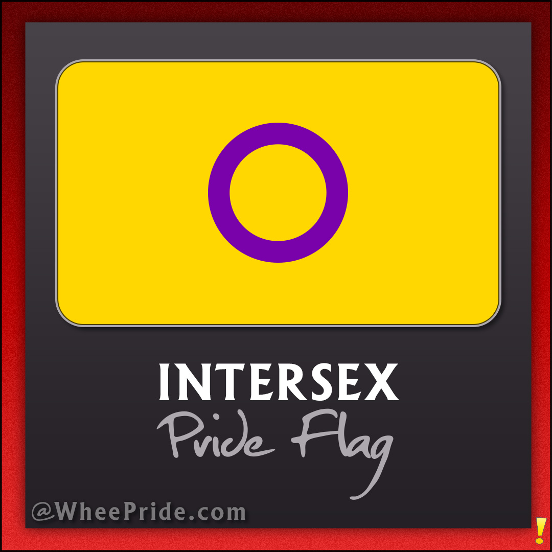
Introduced in 2013, the Intersex Pride Flag breaks from traditional gender symbols and colors. Morgan Carpenter of Intersex Human Rights Australia designed it to celebrate the intersex community. The flag’s yellow background and purple circle stand for unbroken wholeness and completeness.
The choice of colors for the Intersex Pride Flag was intentional. Yellow and purple are not traditionally associated with gender, offering a neutral ground. The purple circle is central, symbolizing the right to bodily autonomy and integrity.
This flag has played a crucial role in raising visibility for intersex individuals, often overlooked in the broader LGBTQ+ discourse. It’s a beacon for inclusivity, rights, and recognition within the community and beyond.
Did you know that the Intersex Pride Flag is one of the few LGBTQ+ flags not modeled after the traditional rainbow flag? Its unique design ensures it stands out, just like the individuals it represents.
The Intersex Pride Flag is more than just a banner; it’s a symbol of pride, unity, and the ongoing fight for recognition and rights. It encourages us to broaden our understanding and embrace every part of the diverse LGBTQ+ spectrum.
Interested in showing your support? Check out our vibrant Intersex Pride collection at Whee! Pride.

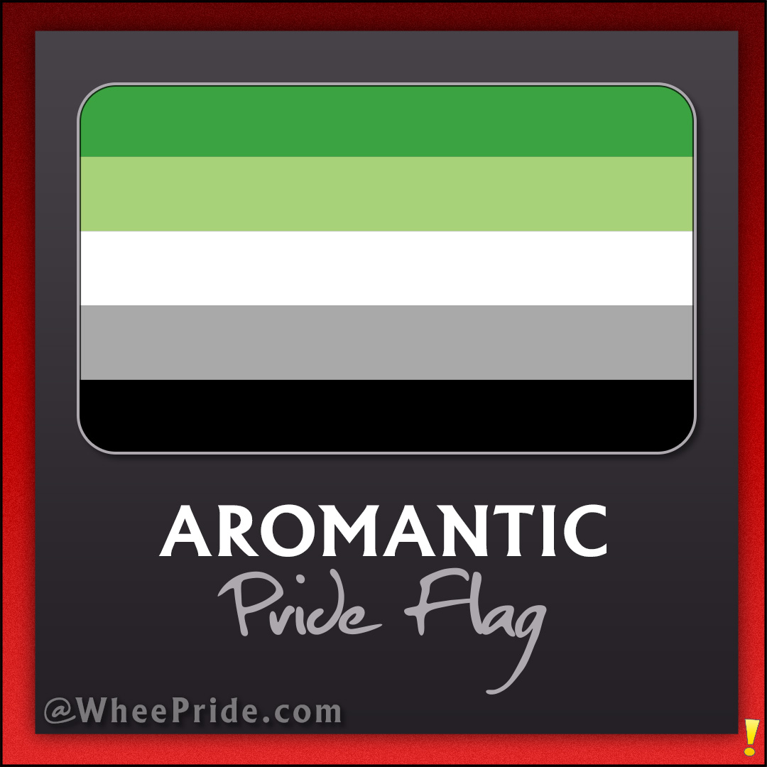
Happy Pride Flag Friday! This week, we're diving into the world of green, white, grey, and black – the colors of the Aromantic Pride Flag. This flag waves with pride, representing a beautiful spectrum of individuals who experience love differently from the romantic tales we often hear about.
Aromanticism is an orientation that describes people who experience little to no romantic attraction, but that doesn't mean they lack deep, meaningful relationships. Aromantic folks form strong bonds based on friendship, shared interests, and other forms of connection that don't necessarily fit the romantic narrative.
Crafted with intention, the Aromantic Pride Flag boasts four stripes, each with its own story. The dark green represents aromanticism, light green for the aromantic spectrum, white nods to platonic and aesthetic relationships, and grey recognizes the grey-area between romance and friendship, with black celebrating the sexuality of aromantic individuals.
Just like the wide range of hues in the flag, the aromantic community is a tapestry of diverse experiences and identities. It's a reminder that love isn't one-size-fits-all and that there's beauty in the diverse ways we experience the world and connect with others.
Here's a fun fact – the Aromantic Pride Flag is often flown alongside the Asexual Pride Flag, as many aromantic people also identify as asexual, but not always. It's a testament to the intersecting experiences within our LGBTQIA+ family.
So as we wrap up this Pride Flag Friday, let's send a round of applause for the aromantic community. And hey, if you're feeling the love for this flag, why not check out our Aromantic Pride merch on Whee! Pride? From vibrant tees to accessories, there's something for everyone to express their unique self. Spread the love and pride, however you feel it!
Feeling the green vibes after learning about the Aromantic Pride Flag? Dive into our collection over at Whee! Pride, where we celebrate every shade of the aromantic spectrum. From chic tees to standout accessories, each piece is designed to let you wear your identity with pride. Whether you're aromantic or an ally, there's something special waiting for you. Let's celebrate the diverse ways we love and connect. Check it out and find your new favorite way to show off your unique pride!
Explore the Aromantic Pride Collection